You can use forms to collect data and store it in FireStart Cloud.
In the form builder, you can customize your form according to your needs. Drag and drop elements from the Controls panel on the left into your form.
You can edit the controls either directly or in the Input properties panel on the right. Mark controls as Required if needed.
Read-only
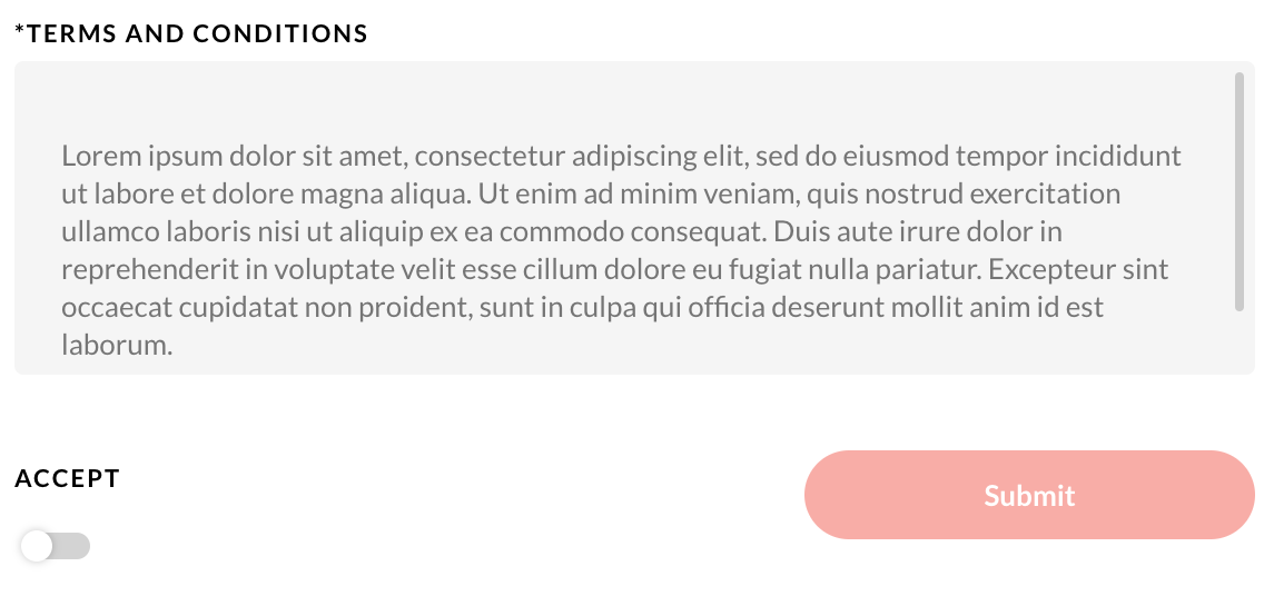
You have the option to mark input fields as Read-only. When you create a form, you can populate the input field according to your needs. If you mark it as Read-only, users cannot edit its content. We recommend using this feature in conjunction with a boolean switch, for example, to ask users for their approval.
All fields can be resized to suite your needs.
Controls
 |
Text: Enter plain text for instructions. |
|
|
Title: Give your form a title. |
 |
Input: A simple input field. |
 |
Number: An input field for numerals. |
 |
Email: An input field for emails. |
 |
Text Area: An input field for plain text. |
 |
Radio: Allows you to add different options to choose from. |
 |
Dropdown: Allows you to add different options to choose from. |
|
|
User: A list of users in your organization to choose from. In the input properties, you can specify a role to limit the selection of users available in the form. For example, select 'HR' to display only users that are members of the HR role. |
 |
Date: A specific date can be chosen. The value will be in dd.mm.yyyy |
 |
Image: One image can be uploaded, and different sizes can be chosen. These images are mostly used to customize your form by adding a logo or a picture. |
 |
File: One or multiple files can be uploaded. The user can upload all data types. |
 |
Section: Use sections to structure forms. |
 |
Boolean: A control that allows for binary variables, for example, yes or no. |
 |
Button: The button is used to submit the form. Its text can be adapted individually. |

